Parkster

  • UX Design

  • Application

Mobile parking & smart mobility service

The Challenge / Problem

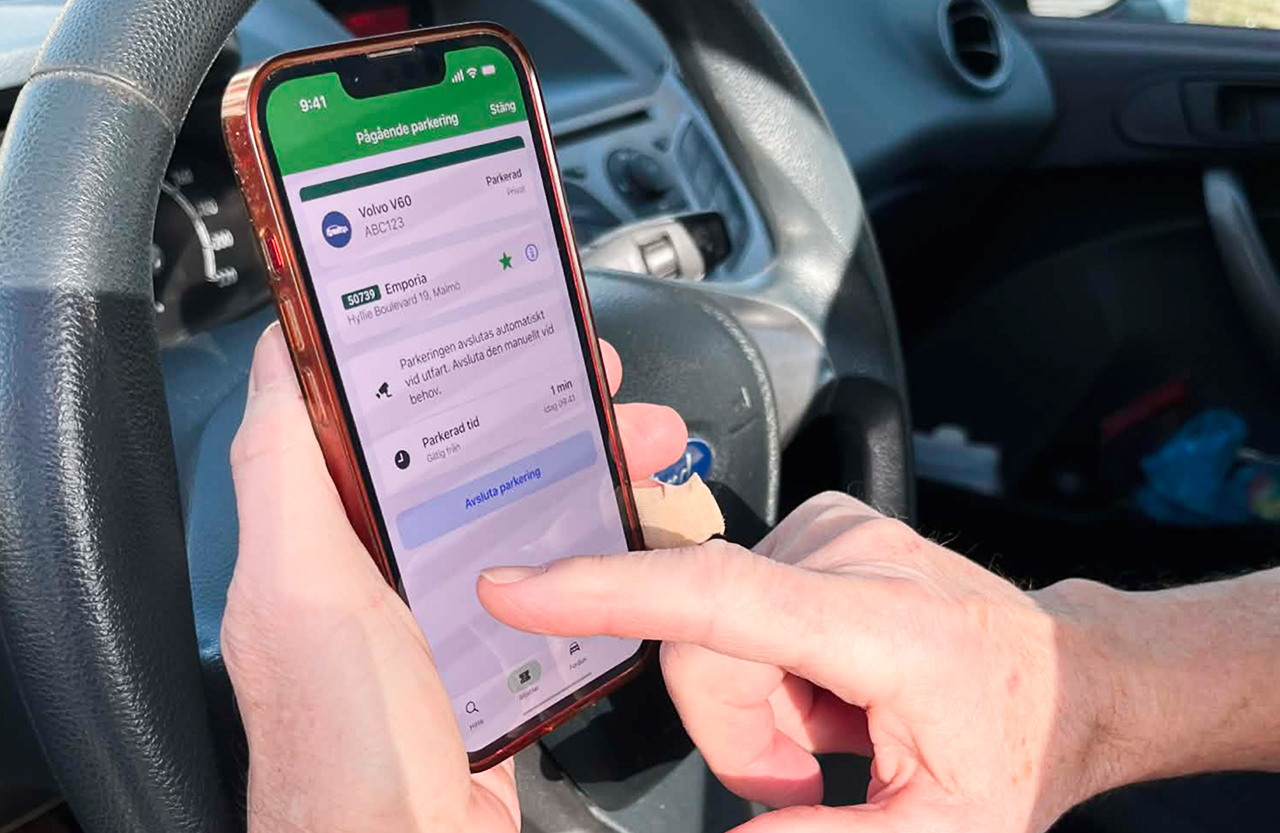
Digital parking solutions often suffer from friction during high-stress moments, such as quick street parking or complex zone selections. Users frequently experienced confusion around automated features and whether parking sessions started or stopped automatically. The core challenge was bridging the gap between digital expectations and the physical parking environment; eliminating user anxiety, preventing parking fines, and clarifying communication across both the app and physical signage.

What I did

  • User Journey Mapping: Analyzed the primary user flow through field research and user interviews to map out end-to-end scenarios, identify pain points, and contrast them with a "dream scenario."
  • Wireframing & UI Refinement: Designed cleaner, high-contrast interface components and sequential screen layouts to speed up interactions and mirror real-world user expectations.
  • Friction Reduction: Simplified zone identification, optimized UX copy, and aligned information architecture across both digital flows and physical signs.

Outtakes from user flow for a first time parker.

​

Outtakes from user flow for a user with automatic parking.

Flow map of user scenarios and identified pain points.

Flow map of the dream user scenario.

Outtakes from user flow of parking ending.

​

​

​

Prior to the updated hierarchical structure.

Reflection

Working with Parkster gave me valuable insight into how established design teams structure their files, while tackling problems with real everyday impact. Uncovering user confusion, like assuming sessions started automatically and risking parking fines as a result, highlighted just how critical clear system feedback is. If I were to do this again, I would dedicate even more time to iterative usability testing to ensure our redesigned flows completely removed that user anxiety.

maxbjorkegren@gmail.com

Let’s talk design over coffee.

Menu

Home

Projects

About

Socials

Linkedin

Instagram

Parkster

  • UX Design

  • Application

Mobile parking & smart mobility service

The Challenge / Problem

Digital parking solutions often suffer from friction during high-stress moments, such as quick street parking or complex zone selections. Users frequently experienced confusion around automated features and whether parking sessions started or stopped automatically. The core challenge was bridging the gap between digital expectations and the physical parking environment; eliminating user anxiety, preventing parking fines, and clarifying communication across both the app and physical signage.

What I did

  • User Journey Mapping: Analyzed the primary user flow through field research and user interviews to map out end-to-end scenarios, identify pain points, and contrast them with a "dream scenario."
  • Wireframing & UI Refinement: Designed cleaner, high-contrast interface components and sequential screen layouts to speed up interactions and mirror real-world user expectations.
  • Friction Reduction: Simplified zone identification, optimized UX copy, and aligned information architecture across both digital flows and physical signs.

Outtakes from user flow for a first time parker.

​

Outtakes from user flow for a user with automatic parking.

Flow map of user scenarios and identified pain points.

Flow map of the dream user scenario.

Outtakes from user flow of parking ending.

​

​

​

Prior to the updated hierarchical structure.

Reflection

Working with Parkster gave me valuable insight into how established design teams structure their files, while tackling problems with real everyday impact. Uncovering user confusion, like assuming sessions started automatically and risking parking fines as a result, highlighted just how critical clear system feedback is. If I were to do this again, I would dedicate even more time to iterative usability testing to ensure our redesigned flows completely removed that user anxiety.

maxbjorkegren@gmail.com

Let’s talk design over coffee.

Menu

Home

Projects

About

Socials

Linkedin

Instagram

Parkster

  • UX Design

  • Application

Mobile parking & smart mobility service

The Challenge

Digital parking solutions often suffer from friction during high-stress moments, such as quick street parking or complex zone selections. Users frequently experienced confusion around automated features and whether parking sessions started or stopped automatically. The core challenge was bridging the gap between digital expectations and the physical parking environment; eliminating user anxiety, preventing parking fines, and clarifying communication across both the app and physical signage.

Key Contributions

  • User Journey Mapping: Analyzed the primary user flow through field research and user interviews to map out end-to-end scenarios, identify pain points, and contrast them with a "dream scenario."
  • Wireframing & UI Refinement: Designed cleaner, high-contrast interface components and sequential screen layouts to speed up interactions and mirror real-world user expectations.
  • Friction Reduction: Simplified zone identification, optimized UX copy, and aligned information architecture across both digital flows and physical signs.

Outtakes from user flow for a first time parker.

​

Outtakes from user flow for a user with automatic parking.

Flow map of user scenarios and identified pain points.

Flow map of the dream user scenario.

Outtakes from user flow of parking ending.

​

​

​

Prior to the updated hierarchical structure.

Reflection

Working with Parkster gave me valuable insight into how established design teams structure their files, while tackling problems with real everyday impact. Uncovering user confusion, like assuming sessions started automatically and risking parking fines as a result, highlighted just how critical clear system feedback is. If I were to do this again, I would dedicate even more time to iterative usability testing to ensure our redesigned flows completely removed that user anxiety.