Extended color range fraom brand colors.
The Challenge / Problem
Complex administrative workflows for medical staff and patient check-in touchpoints lacked accessibility compliance (WCAG 2.1) and interface consistency.
This created friction in high-stress environments, resulting in slower service times for patients and increased cognitive load for the administrative personnel managing the system.
What I did
- Workflow Analysis: Mapped out intricate patient journeys and administrative tasks to identify friction points and streamline interaction patterns.
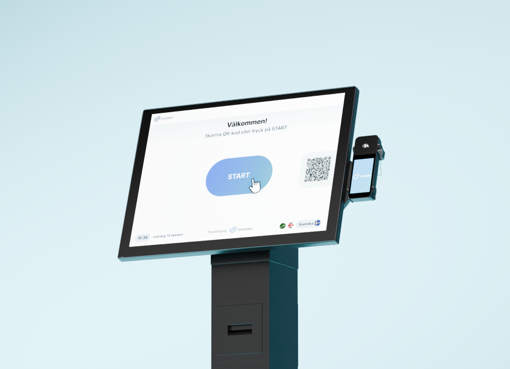
- Accessibility Overhaul: Designed WCAG 2.1 compliant check-in flows for digital self-service terminals, focusing on high contrast, clear touch targets, and assistive readability.
- Interface Design: Crafted streamlined, high-density administrative interfaces tailored for medical staff efficiency.
- Design System Scaling: Expanded and maintained the corporate design system in Figma to ensure long-term UI consistency across all touchpoints.

Icons - with fixed readability thickness.
Prompt boxes on kiosk when checked in.
Brand colos.
Kiosk - Welcome screen.
Kiosk - Available checkins.
All checkins with terminal(s) in admin UI.
Support center in admin UI.
Reflection
Designing self-service check-in kiosks for healthcare reinforced the importance of prioritizing clarity and accessibility over visual decoration to support a wide range of patient needs. Working on the design system also taught me how crucial thorough component documentation is so developers and teammates can seamlessly pick up where I left off.
Looking back, I would have loved to conduct on-site testing in real clinical environments and explore the administrative interface to better understand staff workflows and maintenance needs.