During my internship I took ownership of my role, driving ideas and advocating for strategic needs and opportunities. My core focus was future-proofing the UX by improving accessibility in both the end-user check-in flow via the kiosk and the behind-the-scenes client admin UI.
Carelabs

UX Design
UI Design
Carelabs needed to future proof its check-in system. Make it easier to use and to bring more clarity towards accessibility.
UX & Micro Copy
I identified key areas for improvement in both accessibility and language use. By simplifying and standardizing expression, user flows become clearer, which is particularly beneficial for users with functional variations. This approach minimizes misunderstandings, saves staff time and strengthens both user satisfaction and overall efficiency.
The Design System is a living document; continuously evaluated and refined based on the needs of all users, including both customers and patients.
The primary goal was to establish consistency and reduce the need for creating new solutions from scratch. To achieve this, I structured and standardized components for maximum reusability and design coherence across all products.
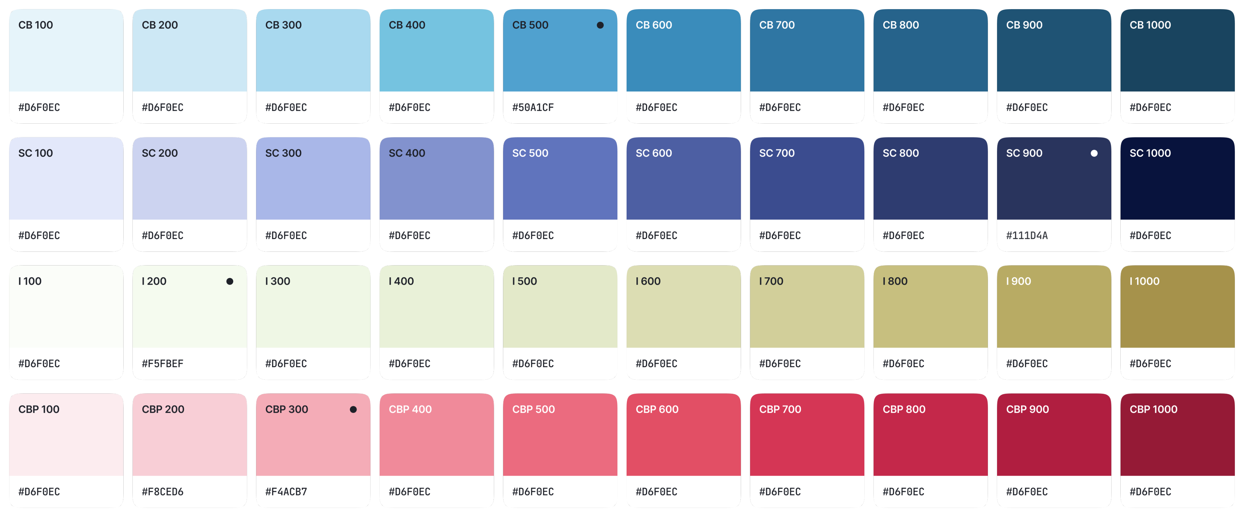
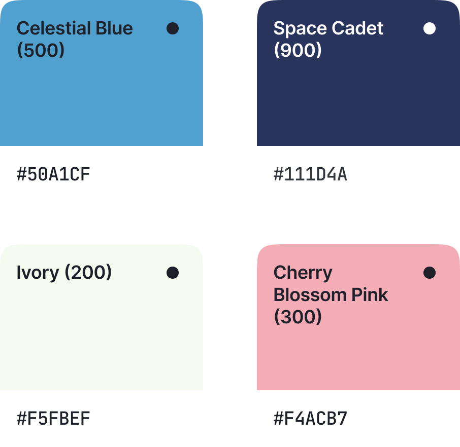
The color palette was expanded with brand-adapted colors to enable flexible, context-specific solutions that can cater to various industries and brand identities.


Animation
To enhance the user experience, I introduced fundamental loading animations: such as, skeleton screens to indicate content structure and an abstract loading indicator for ongoing system activity or transactions.
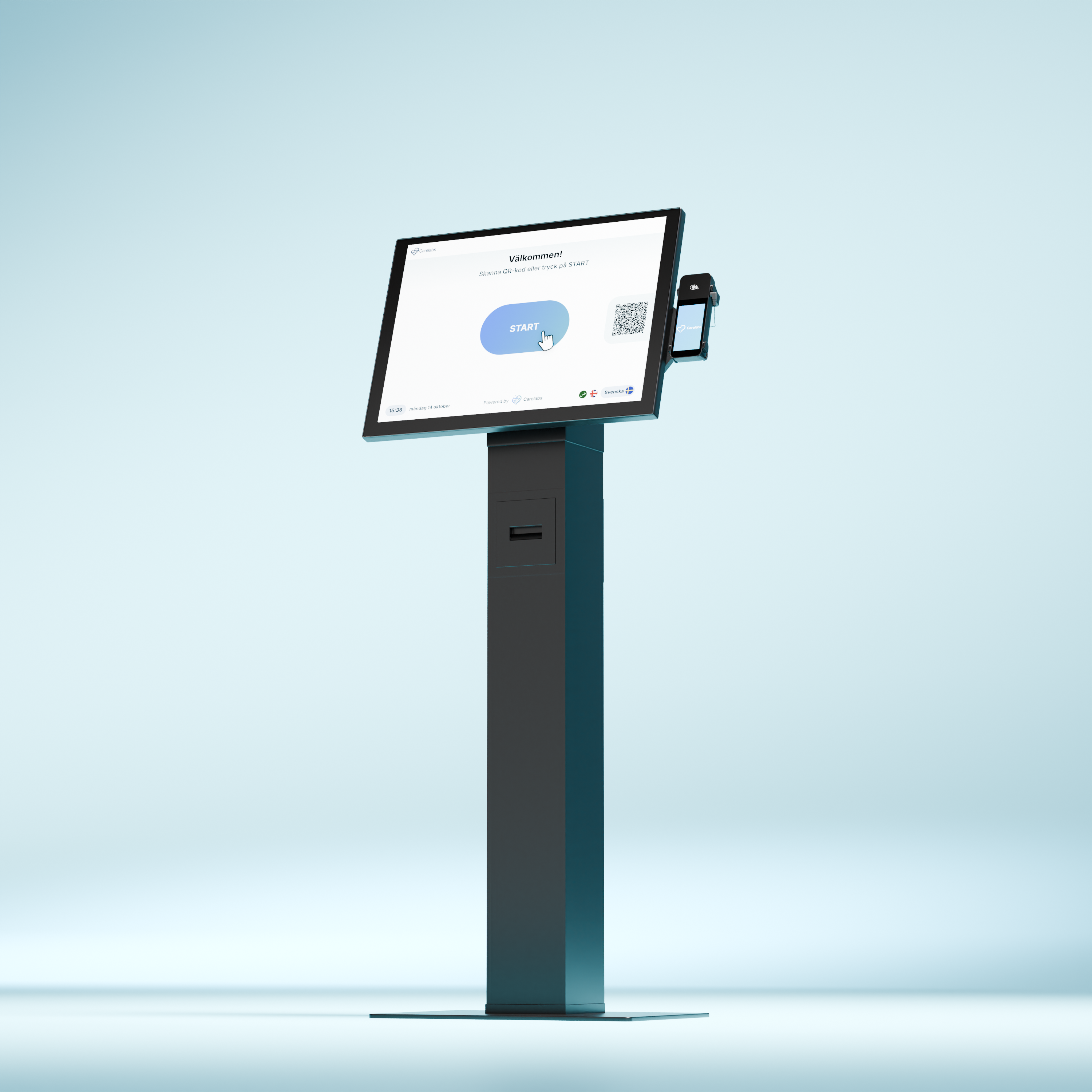
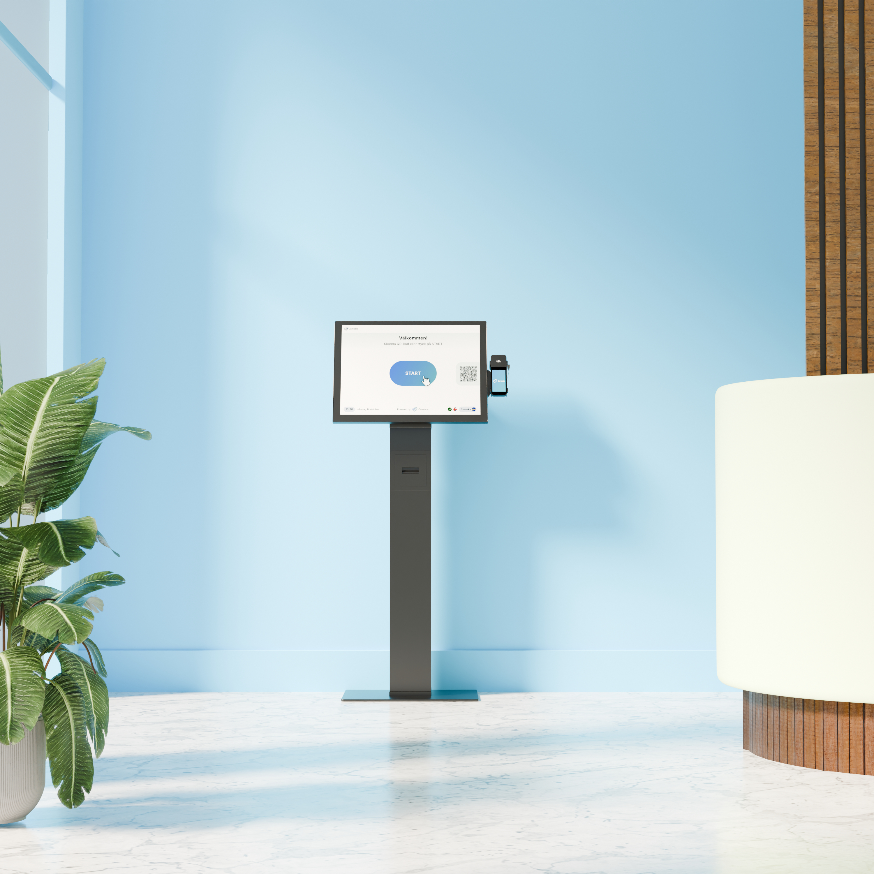
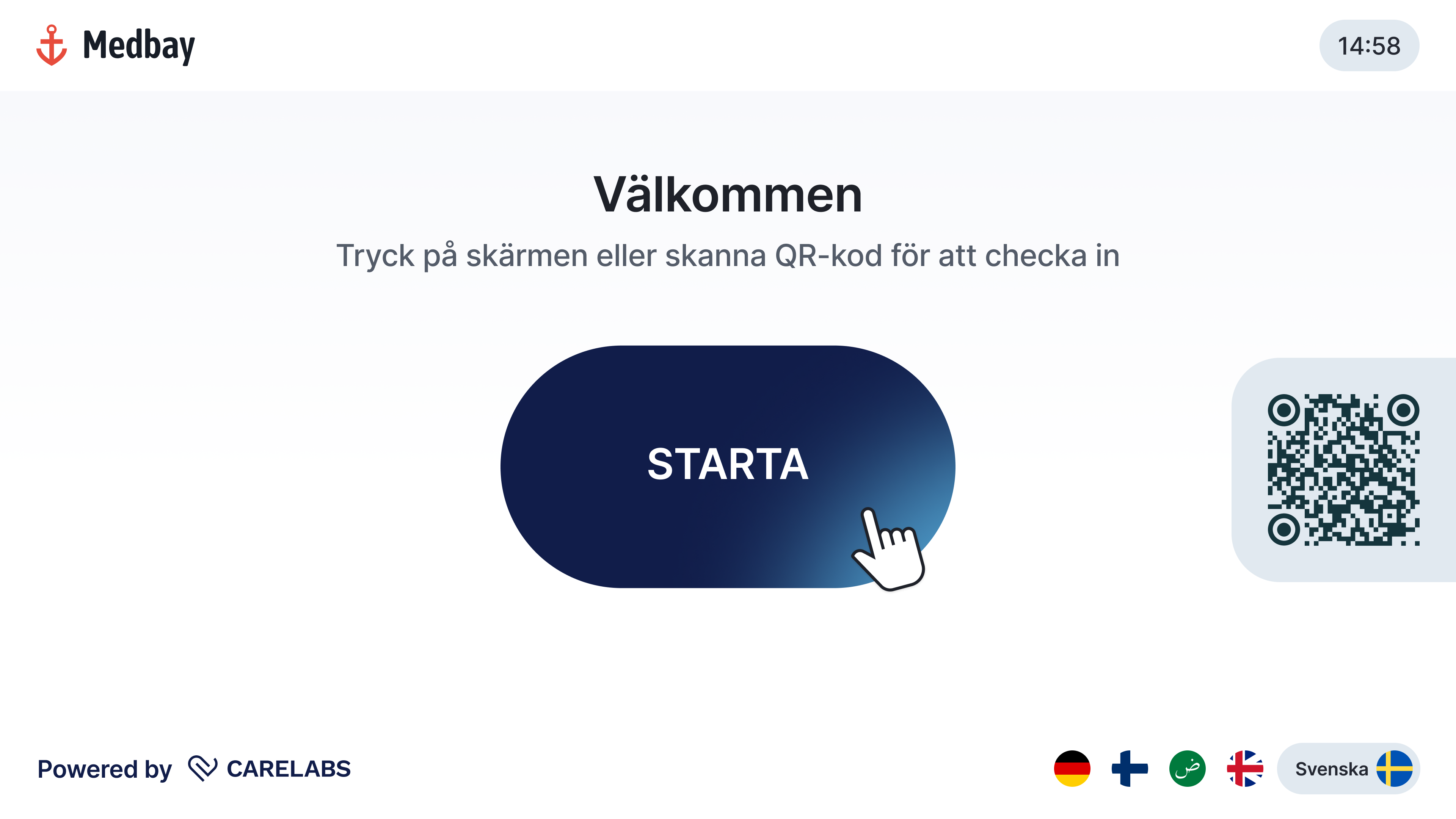
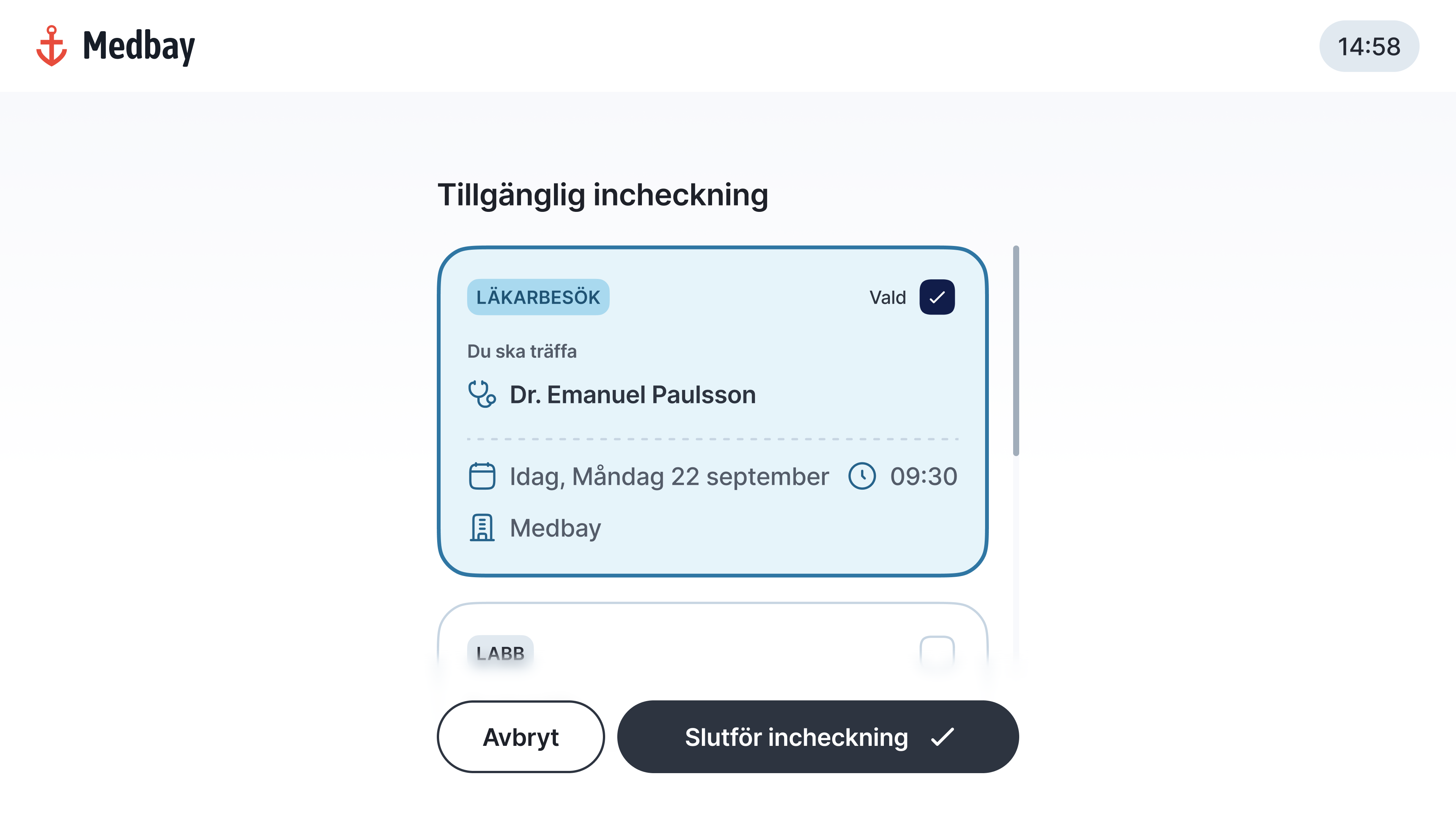
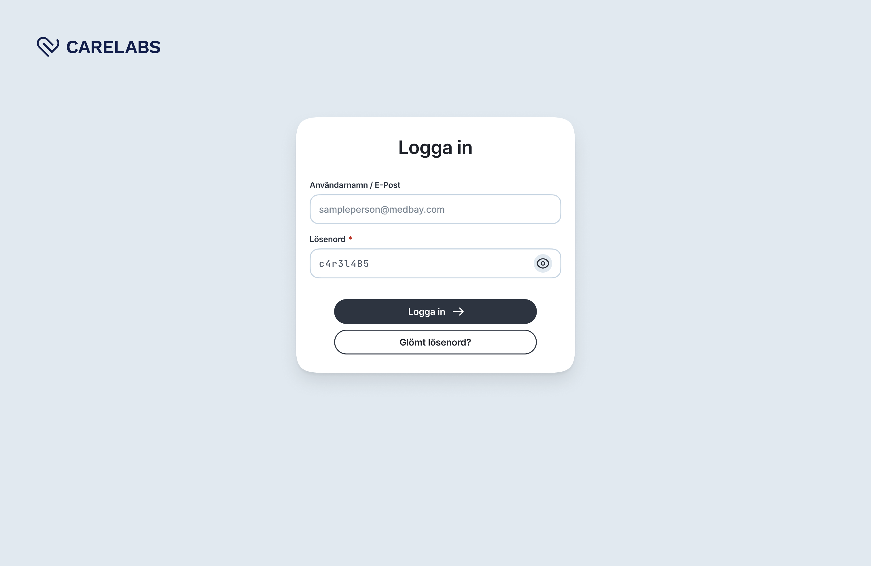
The kiosk interface is accessed by patients from diverse backgrounds, necessitating a clear and concise user experience.
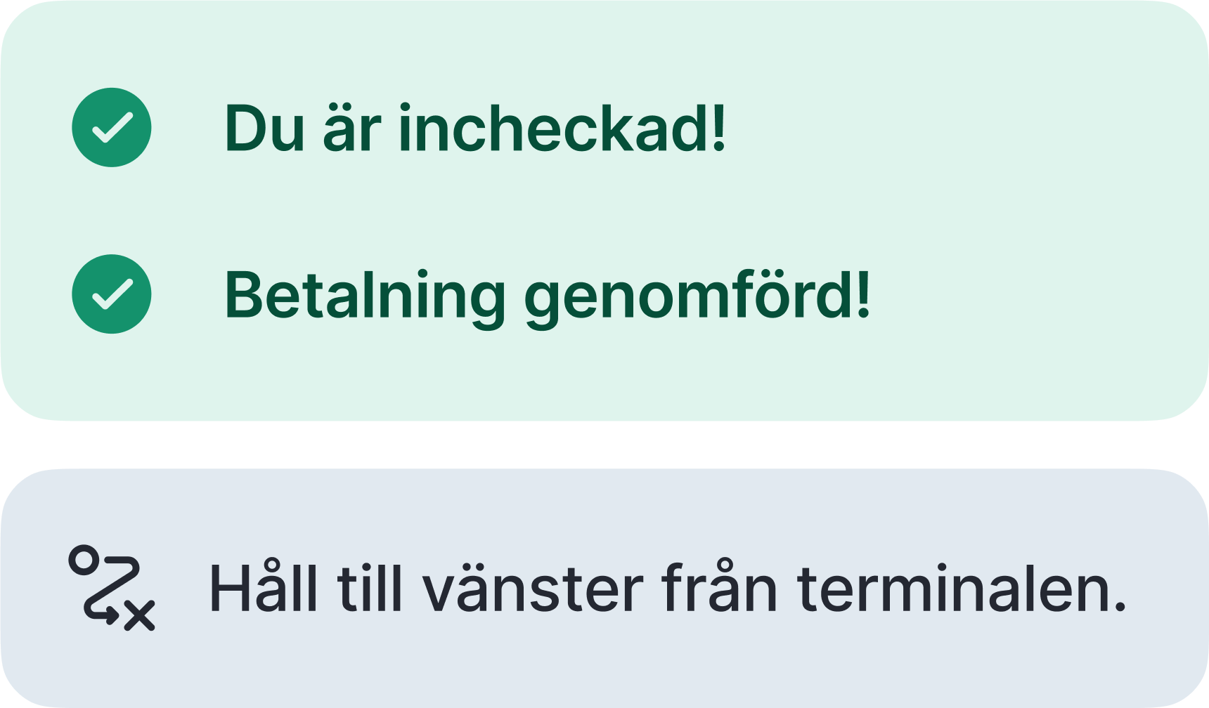
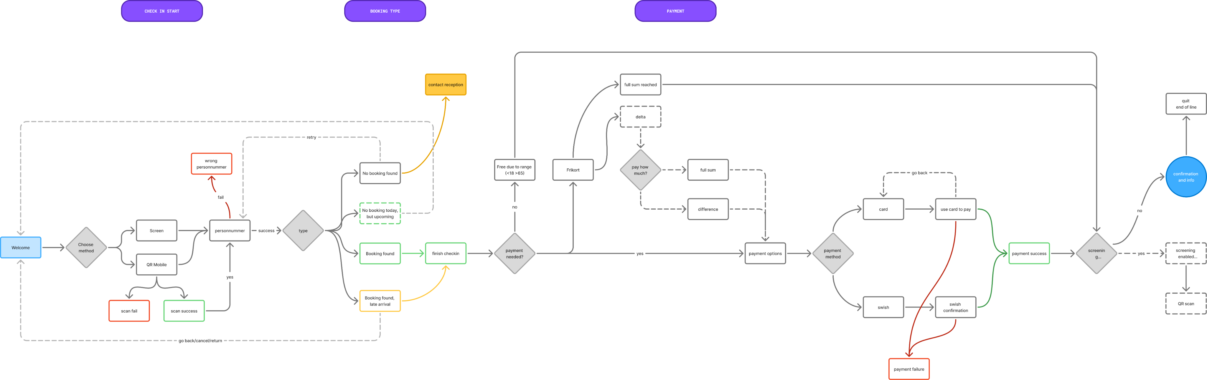
The check-in process is streamlined through clearer feedback mechanisms and a unified language. Buttons and key content elements are placed in fixed locations to ensure predictable and consistent use.
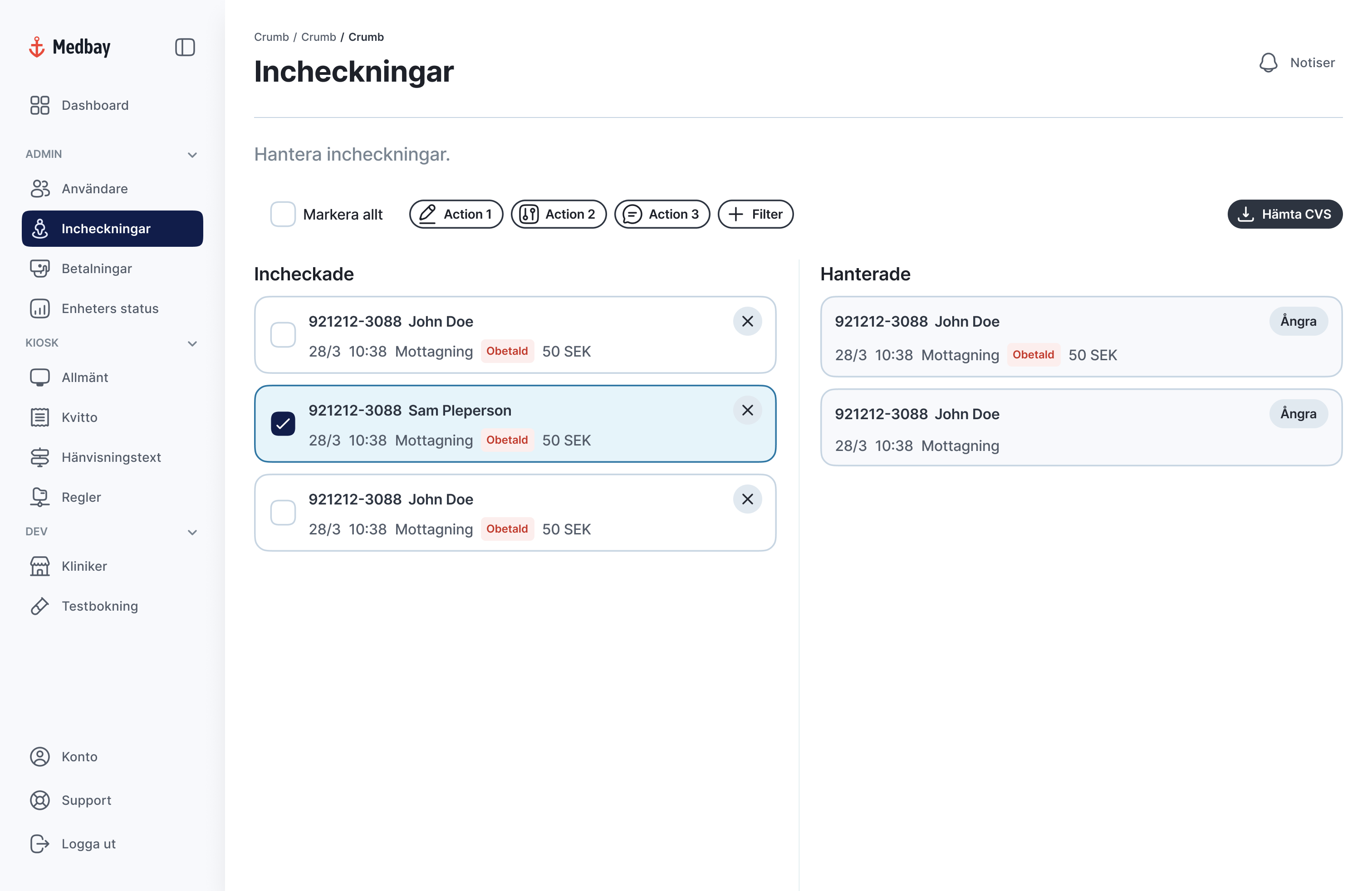
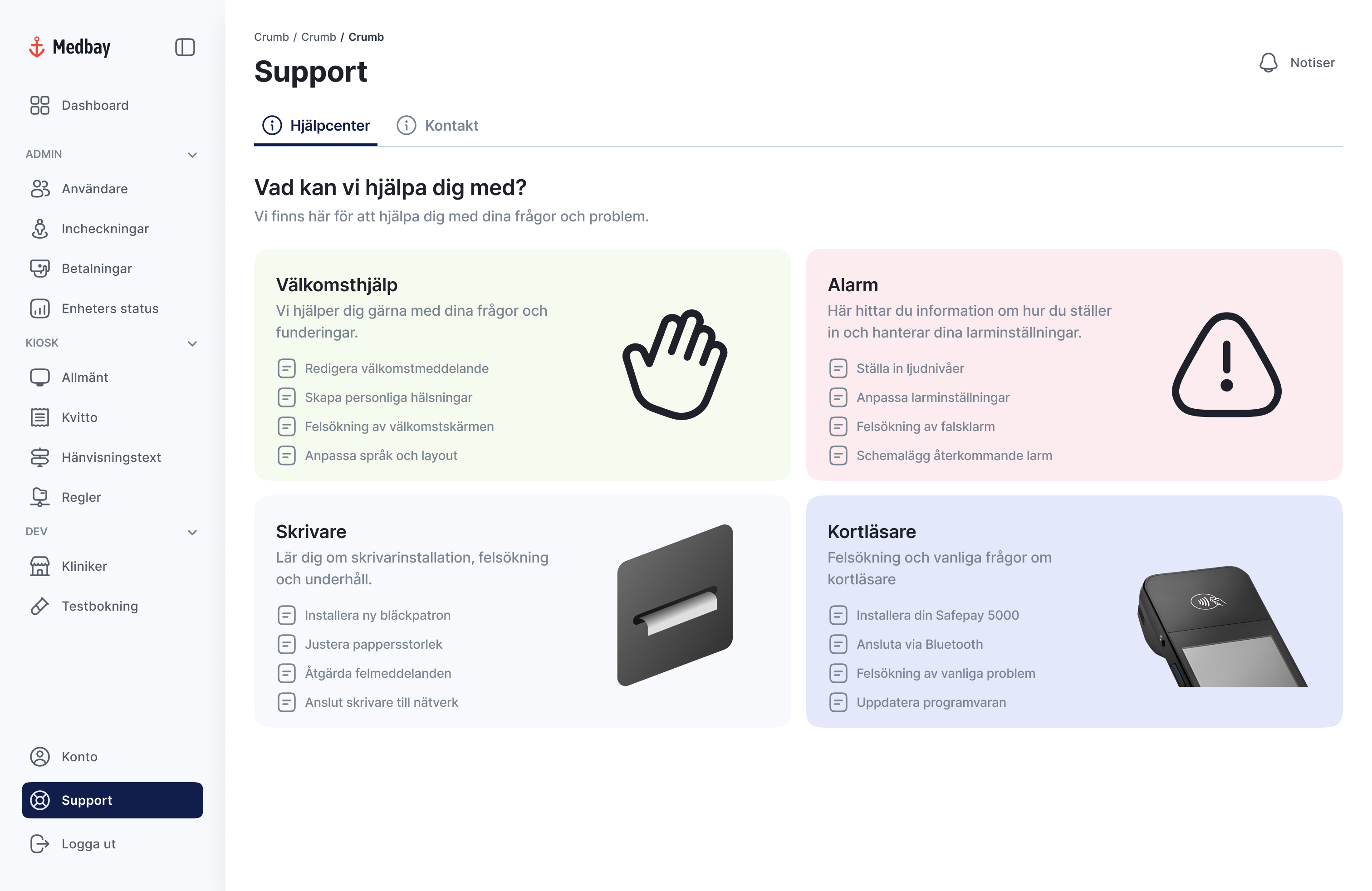
Carelab’s clients who manage the kiosk’s UI need a clear tool to control the connections between appointments, schedules, doctors and patients.
Chunking
Functions are grouped to reduce searching. Standardizing content types reduces information overload. The interface is consistent with the kiosk and the design system enables component reuse between both.
Reflection
A key learning experience has been establishing the right balance between independent work and knowing when to ask for support. As a result, I've grown more conscious of the pressure to be a "unicorn" capable of handling every task – an expectation that is particularly relevant when you are the sole designer.
Due to insufficient documentation in Figma, I made the decision to rebuild the design system from scratch. This was done to prevent unnecessary rework and streamline the creation of new modules and components. To gain necessary clarity, my process involved testing, deconstructing existing components, reviewing comments, and actively asking questions to validate my underlying assumptions.


Carelabs
UX Design
UI Design
Carelabs needed to future proof its check-in system. Make it easier to use and to bring more clarity towards accessibility.
During my internship I took ownership of my role, driving ideas and advocating for strategic needs and opportunities. My core focus was future-proofing the UX by improving accessibility in both the end-user check-in flow via the kiosk and the behind-the-scenes client admin UI.
UX & Micro Copy
I identified key areas for improvement in both accessibility and language use. By simplifying and standardizing expression, user flows become clearer, which is particularly beneficial for users with functional variations. This approach minimizes misunderstandings, saves staff time and strengthens both user satisfaction and overall efficiency.
The Design System is a living document; continuously evaluated and refined based on the needs of all users, including both customers and patients.
The primary goal was to establish consistency and reduce the need for creating new solutions from scratch. To achieve this, I structured and standardized components for maximum reusability and design coherence across all products.
The color palette was expanded with brand-adapted colors to enable flexible, context-specific solutions that can cater to various industries and brand identities.

Animation
To enhance the user experience, I introduced fundamental loading animations: such as, skeleton screens to indicate content structure and an abstract loading indicator for ongoing system activity or transactions.
The kiosk interface is accessed by patients from diverse backgrounds, necessitating a clear and concise user experience.
The check-in process is streamlined through clearer feedback mechanisms and a unified language. Buttons and key content elements are placed in fixed locations to ensure predictable and consistent use.
Carelab’s clients who manage the kiosk’s UI need a clear tool to control the connections between appointments, schedules, doctors and patients.
Chunking
Functions are grouped to reduce searching. Standardizing content types reduces information overload. The interface is consistent with the kiosk and the design system enables component reuse between both.
Reflection
A key learning experience has been establishing the right balance between independent work and knowing when to ask for support. As a result, I've grown more conscious of the pressure to be a "unicorn" capable of handling every task – an expectation that is particularly relevant when you are the sole designer.
Due to insufficient documentation in Figma, I made the decision to rebuild the design system from scratch. This was done to prevent unnecessary rework and streamline the creation of new modules and components. To gain necessary clarity, my process involved testing, deconstructing existing components, reviewing comments, and actively asking questions to validate my underlying assumptions.